Function to help access clustering results from ulrb.
Usage
plot_ulrb(
  data,
  sample_id = NULL,
  taxa_col,
  plot_all = TRUE,
  silhouette_score = "Silhouette_scores",
  classification_col = "Classification",
  abundance_col = "Abundance",
  log_scaled = FALSE,
  colors = c("#009E73", "grey41", "#CC79A7"),
  ...
)
Arguments
- data
a data.frame with, at least, the classification, abundance and sample information for each phylogenetic unit.
- sample_id
string with name of selected sample.
- taxa_col
string with name of column with phylogenetic units. Usually OTU or ASV.
- plot_all
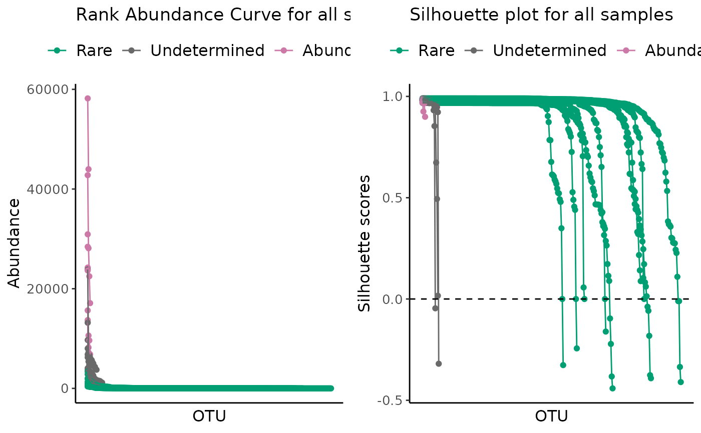
If TRUE, will make a plot for all samples with mean and standard deviation. If FALSE (default), then the plot will illustrate a single sample, that you have to specifiy in sample_id argument.
- silhouette_score
string with column name with silhouette score values. Default is "Silhouette_scores"
- classification_col
string with name of column with classification for each row. Default value is "Classification".
- abundance_col
string with name of column with abundance values. Default is "Abundance".
- log_scaled
if TRUE then abundance scores will be shown in Log10 scale. Default to FALSE.
- colors
vector with colors. Should have the same lenght as the number of classifications.
- ...
other arguments
Value
A grid of ggplot objects with clustering results and
silhouette plot obtained from define_rb().
Details
This function combined plot_ulrb_clustering() and plot_ulrb_silhouette().
The plots can be done for a single sample or for all samples.
The results from the main function of ulrb package, define_rb(), will include the classification of
each taxa and the silhouette score obtained for each observation. Thus, to access the clustering results, there are two main plots to check:
the rank abundance curve obtained after ulrb classification;
and the silhouette plot.
Interpretation of Silhouette plot
Based on chapter 2 of "Finding Groups in Data: An Introduction to Cluster Analysis." (Kaufman and Rousseeuw, 1991); a possible interpretation of the clustering structure based on the Silhouette plot is:
0.71-1.00 (A strong structure has been found);
0.51-0.70 (A reasonable structure has been found);
0.26-0.50 (The structure is weak and could be artificial);
<0.26 (No structure has been found).
Examples
# \donttest{
classified_species <- define_rb(nice_tidy)
#> Joining with `by = join_by(Sample, Level)`
# Default parameters for a single sample ERR2044669
plot_ulrb(classified_species,
sample_id = "ERR2044669",
taxa_col = "OTU",
abundance_col = "Abundance")
#> Warning: If you want to plot only ERR2044669 use plot_all = FALSE
#> Warning: If you want to plot only ERR2044669 use plot_all = FALSE
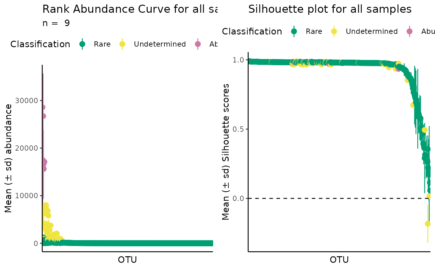 # All samples in a dataset
plot_ulrb(classified_species,
taxa_col = "OTU",
abundance_col = "Abundance",
plot_all = TRUE)
# All samples in a dataset
plot_ulrb(classified_species,
taxa_col = "OTU",
abundance_col = "Abundance",
plot_all = TRUE)
 # All samples with a log scale
plot_ulrb(classified_species,
taxa_col = "OTU",
abundance_col = "Abundance",
plot_all = TRUE,
log_scaled = TRUE)
# All samples with a log scale
plot_ulrb(classified_species,
taxa_col = "OTU",
abundance_col = "Abundance",
plot_all = TRUE,
log_scaled = TRUE)
 # }
# }